
Mobile Optimization – Making Your Website “Mobile Friendly”
What is mobile optimization and how does it help bring your business up to speed? If you’re already familiar with the term “mobile optimization” you can either bear with me or skip to the next section.
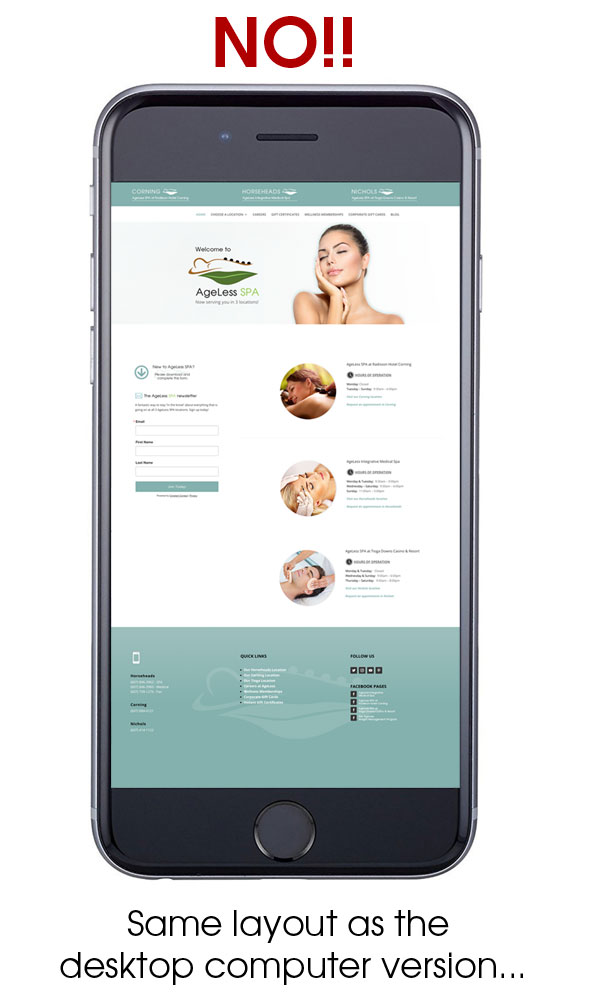
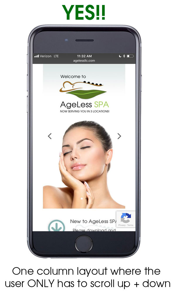
In non-technical terms, a website that is mobile optimized LOOKS the way it should and BEHAVES the way it should on a smart phone. Nothing too mysterious there, right? Basically, a mobile optimized website will format itself according to the size of the screen a person is using.
This means that if the “normal” version of your website (what you’d see on a desktop or laptop computer) has, for example a 2 or 3 column layout with very small font then that layout should adjust itself accordingly when viewed on a smart phone, or even a very small tablet. It should become a ONE COLUMN layout with an appropriate font size so that all a user needs to do is scroll up and down on their phone. Essentially it means they (users) are NOT forced to try and zoom in with their fingers and shove their phone up to their face in order to navigate around and find the information they’re looking for.
What’s the big deal?
One of the first arguments that might be brought to the table by a business owner that has a non-mobile friendly website is:
“What’s the big deal? People are still finding my site on their phone and I am still getting new business!”
Well, it’s a big deal for two reasons. Before I explain what those reasons are, though, let me just say that if you are the ONLY business of your kind in a particular geographic location, then you might MIGHT be ok without optimizing your outdated website for mobile phones. At least in the (very) short term. I still wouldn’t recommend it, though.
Two Compelling Reasons to Make Your Website Mobile Optimized
Reason 1: Because Google Said So!
That’s a pretty strong argument all by itself! But let me explain what I mean more specifically…
Back in April of 2015 (almost 3 years prior to the date I am writing this post), Google announced yet another of their infamous algorithms. This one was called MOBILEGEDDON. The purpose of this particular algorithm was to try to make the mobile web a little better by more or less “cracking down” on websites that were not mobile friendly.
Follow the link below to learn more about MOBILEGEDDON.

Now, Google won’t eliminate outdated websites entirely from mobile searches (at least I don’t believe they will) any time soon, especially when you consider that they (Google) want their users to have the best possible experience, and part of that experience includes returning the most relevant search results for a user; and sometimes this means returning non-mobile friendly sites whether they like it or not.
What they CAN do (and have done), however, is dramatically decrease the ranking power of sites that are not mobile friendly. This means that, essentially, having a mobile friendly website has become part of an overall good SEO (search engine optimization) strategy. All other things being relatively equal between two competing websites (or more), if one site is optimized for mobile devices and the other isn’t, guess who wins?
Reason 2: Because People Are Lazy
Maybe that’s not the nicest way to say it, but it’s true.
In the general public’s defense, given the fact that there are usually sooo many options to choose from on a Google SERP (Search Engine Results Page) why would anyone bother to try to fight through a website that is impossible to read and navigate on a smart phone if that’s what they’re using?
Example:
Say you’re broken down on the side of the road and you need a towing company. You speak your search into your Google App, or type it. You get a list of dozens of links for local towing companies to choose from and you pick a link at random that takes you to a website which MIGHT look good on your 27″ monitor at home, but on your 3″ smart phone screen, not-so-much! Are you honestly going to take the time to pinch open your screen and shove the phone up to your face in the hopes you’ll be able to see the business rates, phone number, etc? Or, are you simply going to remember that you picked this website from literally hundreds of others and just hit the “back” button and move on to the next towing company? The answer is pretty obvious. So why would you expect anyone else to behave much differently?
Now simply substitute the towing company for almost ANY type of business in Any-Town USA and the same principals apply. Maybe you are a lawyer in a large metro area. Your website was put together by your nephew in early 2005 when he was first learning html code (don’t laugh, look around you…). Now, John Smith does a Google search for lawyers in your area that cover your area of practice. Somehow, your firm manages to come up on page 1 or 2 in the search and so he clicks through to your website…only to find a desktop version of a site smashed down into the size of a tiny screen. He hits the back button and chooses your competitor’s website who has a site that happens to be easy to navigate in general, have a nice big Call to Action Button, a clickable phone number, AND is mobile optimized. Who gets the business, you or him?
My Site Is NOT Mobile Friendly. What Do I DO?
Funny you should mention that! There are several answers and they are all situation dependent.
Mobile Optimization Solution 1: DIY. Do It Yourself.
Keep in mind, only endeavor to do this if you are already tech savvy OR have lots of time on your hands. If you are super tech savvy then there’s a really good chance you’d never be reading an article like this in the first place because you’d already understand the need for mobile optimization and you wouldn’t be 3+ years behind the times! That being said, maybe you’re just super ambitious and don’t want to pay someone.
If this is the case, I would suggest you take the necessary time and effort and learn how to use one of the free or inexpensive Content Management Systems available out there that will render your site mobile friendly as you build it. Possible solutions include:
- Joomla – A great platform. You’ll get great results…but the learning curve is HUGE. However, if you have the time then go for it, by all means.
- Weebly – A decent to mediocre platform. However, you’re sort of forced into cookie cutter land based on the templates they provide. Good solution if you don’t have a ton of time and don’t care a whole lot about good design. If you just want to get your information out to the world and aesthetics mean nothing, Weebly is a good solution.
- WordPress – A fantastic platform. The structure of WordPress itself doesn’t take too long to learn. With some focused effort and a couple weeks of time, the basics can be mastered fairly easily. Where WordPress can get complicated are with the various themes. Like Weebly, you have the ability to choose from ridiculously simple cookie cutter themes that can get you by in a short amount of time. Unlike Weebly, however, you have the ability to use some really beautiful themes that can open up your creativity if you are so inclined. These premium themes can be a world unto themselves to learn about and use properly. So, WordPress leaves a lot of the choice in your ballpark, so-to-speak.
- WIX – Eh. Akin to Weebly, WIX is a cookie cutter solution. It can serve its purpose I suppose, but is incredibly limiting not just in terms of design, but in terms of the other aspects of SEO too. If you really need a simple, stupid solution then I would personally opt for Weebly and just ignore WIX, at least for the time being, despite their super cool use of hipsters in YouTube Ads.
Mobile Optimization Solution 2: Pay someone. Just bite the bullet!
Of course I’d say that, right? Because I am one of the “someones” that stands to get paid. How selfish of me!
Seriously though, there are a couple of other “solutions” which I’ll call “semi solutions” and I’ll describe them briefly below. However, if you really do care about your website and your overall web presence you’ll either take the time to learn to do it yourself, or hire someone to do it correctly. Because the other alternatives are “iffy” at best.
Why would I choose to pay someone for this?
Reason 1: Time
Presumably you’d hire someone that has done this sort of thing before! Time is money for business owners. This one is kind of a no brainer.
Reason 2: Overall Expertise
Working with a professional has more benefits than just saving you time (and thus money). They will likely see other improvements that can be made to the site along the way. If you’re going to take the plunge and have your site overhauled anyway, this might be an excellent opportunity to make improvements to the site as a whole. Of course you want to be aware that, just like any other professional the person you hire may try to sell you things you don’t need. Be sure to have him/her explain the benefits of their “add ons” and don’t be afraid to say, “no”, or at least “not right now” if you can’t afford it. If the person you hire is good, they’ll maintain an excellent working relationship with you and will be around in the future should you ever decide to take them up on earlier suggestions.
Reason 3: Future Support
I can guarantee you that, if you hire someone worth their salt, you will begin to see how crucial your overall web presence is to your business. Both your actual site and otherwise. A professional (as mentioned before) will likely have MANY suggestions beyond just making your site mobile optimized.
Again, any suggestions they offer need not be acted on immediately. After all, you’ve gone this long without even having a mobile friendly website! However, some great “seeds” may get planted in your brain and, perhaps in the future you will want to act on a few of those ideas. Coming around full circle to Reason number 1: Time – you may not have time to learn to act on these suggestions yourself. But, now you know someone(s) that can help you out and get you pointed in the right direction.
Mobile Optimization “semi” Solutions
Going to keep this last section brief. Couple of reasons for this. First, I don’t know all that much about them so I don’t have much business talking too much about them.
Semi-Solution 1: A separate version of your website for mobile/smart phones
Back when smart phones were new, this was sort of a viable option simply because a lot of the technology and languages used to make websites look decent on smart phones were very new and imperfect.
Nowadays, unless you own some monstrosity of a web presence like YouTube, Amazon or facebook, having a separate website for mobile is way too cumbersome. At least in my opinion. I mean, imagine having to essentially update 2 websites every single time you had even the most minor of changes to make? Seems silly to me.
Semi-Solution 2: Using an App to make your site mobile friendly.
Honestly, I would personally avoid this like the plague. It makes your website look very childish on smart phones for one thing. And secondly, I have NO idea how search engines (*cough, Google) “sees” websites that use this technology. For all I know maybe they see it as a viable solution. I really don’t know, nor do I care because, like I said, the end product is absolutely horrific.
In Closing…
I wrote this post, obviously, so you would understand what a mobile friendly website is and what to do if your own website is not. However, I also wrote it because I can help. If you’re interested in taking a look at some of my work before we talk, please check out my web design page. If you just want to talk right away you can give me a call at (607) 329-8260 and I would be happy to chat with you.
• LOOK GOOD
• BE FOUND
• MAKE MORE MONEY
Recent Comments